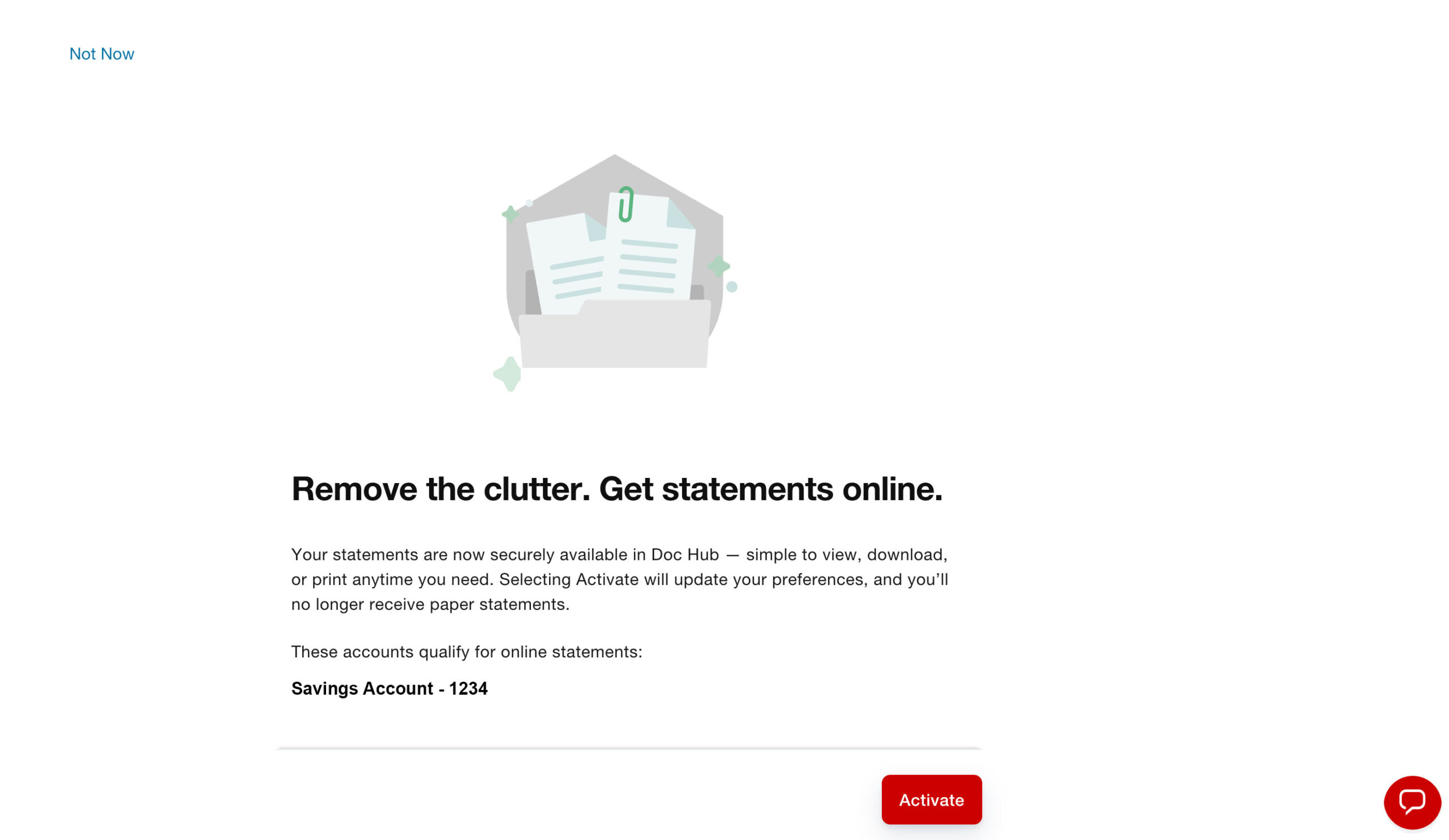
Here is an example of a design that encourages users to upgrade by leveraging common user interaction patterns. The “Activate” button is bright red, highly prominent, and positioned where users typically expect the primary action to appear. In contrast, the “Not Now” option is styled to resemble a simple text link and is placed in the upper-left corner, making it much less noticeable and easier to overlook.
What is your impression of this design? Does it feel like an effective user experience, or does it come across as overly persuasive?